
Each month, we invite élite art critic Braithwaite Merriweather to appraise the box art of the latest game releases. In between his time spent wandering the corridors of culture, Merriweather writes on a freelance basis for various publications, including Snitters and Nuneaton à la Carte. If you are unaware of his prowess, rest assured; he’s on a crusade to educate the unwashed. Put simply, he’s a man that needs no introduction.
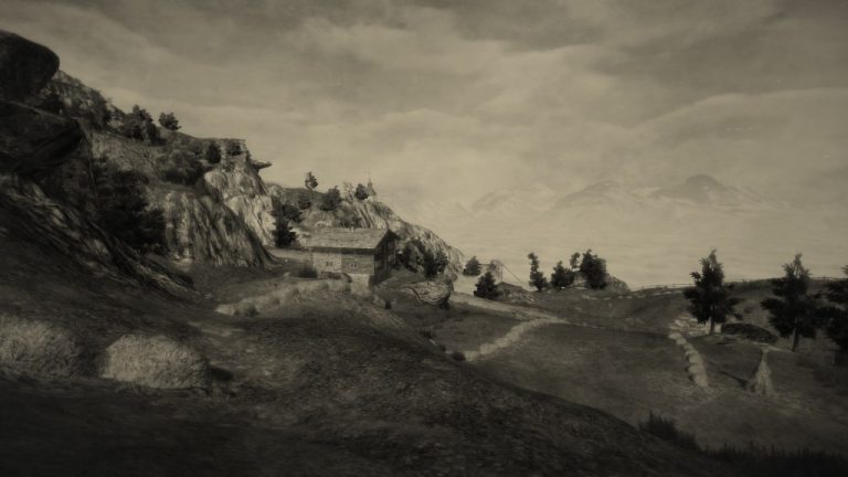
Friends, I must guiltily admit to succumbing quite boringly, once in a blue moon, to the marshy pull of nostalgia—to the paranoid suspicion, prickling in the heart of every honest critic, that he may not be living through the rarefied times: that the Golden Age may long since have paled into silver, rusted into bronze, and liquesced into a pungent run-off, fit to toxify a local river. I look at the great box art of the early nineties—the likes of “Starwing,” whose proudly posed beasts suggested that Orwell’s Animal Farm had been shot into space; and the gold-plated cosmonaut of “Earthbound,” planted in a swirling, multicoloured murk—and I wonder if the artistry behind the box art of today hasn’t been sucked into an airless vacuum of its own. Staring out at the multicoloured murk before us, we could be forgiven for asking, “Where are our gold-plated champions?” Is the entire medium dearthbound?
On such dispiriting mornings, as one leans against the worktop, waiting for the kettle to rumble to its steamy finish, wreathed in the harsh blue haze of a new day, one would do well to remember that every epoch is pocked with crap—that those gems that glint at us from the shadows of the receding past were surrounded, in their day, by mediocrity. The money men always exerted their squeeze, as they do now, sapping vibrance from the veins of any upstarts and sanding off the sharp edges of talent with an eye for easy marketing. So it is that I look to this month’s crop of box art hoping to boost my spirits and stoke the embers of my passion. To the work!
Stubbs the Zombie in Rebel Without a Pulse
Well, someone else is clearly tired of the business side of box art, too. Consider this work, entitled “Stubbs the Zombie in Rebel Without a Pulse,” in which we see an eager, green-skinned gentleman, preparing to feast on the skull of the poor fellow in his filthy clutches. What better metaphor for those that salivate over margins of profit, while chewing on the creative minds that power the industry? Most of the time, satire, when daubed onto the canvas, sours quickly; here, however, the artist behind this work has managed to make a point in paint and not forgotten to leave a mark on our imagination.
This work nods back, with mischievous intent, to Norman Rockwell. The piece in question—and in the crosshairs—is “Expense Account” (1957), which Rockwell painted for the Saturday Evening Post. And, in the homage, a second, more hopeful interpretation is unearthed. Look at the ghoul in the new work. Now gaze at the flustered figure of “Expense Account.” Does one not spring—or moulder—from the other? Can’t you just imagine this gentleman, crammed into coach class and sweating over his assembled papers, suddenly reanimating from his mid-life death, firing up the cigarette tucked behind his ear, and deciding to spatter the town red? Money, and its attendant troubles, has left a nasty trace on this poor soul—hence the cash-coloured complexion—but he’s shambling off into the sunset nonetheless. The artist behind this work has fired off a sardonic jab at the corporate overlords of the box art world, holding them to account no matter the expense, while infusing the work with infectious cheer. A rebel with a pulse!
Harvest Moon: One World
Yanking us swiftly in the opposite direction, to the pasteurised fields of the “glocal,” is this new work, “Harvest Moon: One World.” Everything about it smacks of boardroom oversight—the plastically bright hills, the grinning animals, the garish subtitle. It’s the sort of image that a pharmaceutical company might whip up, lacquering its use of dangerous pesticides with smiles and saturated colours. It bears more than a passing resemblance to that Coke advert, from 1971, in which an innocent hillside was beset by gormless hippies. There is no homage here, no reverence, no artistic flair—only the vinegar-thin veneer of the homely and the wholesome, spread taut over an abyss of human commerce and consumption. They are trying to harvest something here, all right but it isn’t the moon; it is our conscience, and our complacence in their foul “One World” vision. If only Stubbs would rear his ugly head and ravage this work, clawing through the crops and munching on these happy morons. There’s more life in one of his bony fingers than there is in this curdling sweep of zombified farmland.
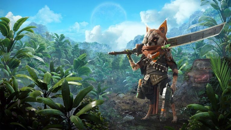
Monster Hunter Rise
Looking at the final piece, entitled “Monster Hunter Rise,” I was going to write about the influence of Hiroshi Yoshida present in this work, at the looming magnificence of “Fujiyama From Kawaguchi Lake” (1926), mingled with the skulking lethality of “Tiger,” (c. 1784-96) by Gan Ku. But the trouble is that, when looking at this work—with its dun and dour shades, its slashes of sword and claw—I am reminded of my ex-wife. After all, she was a monster from whose abyss it took me years to rise. This is not the fault of the artist, of course; what is the fault of the artist is the lack of flair and imagination, of passion, and the general sense of fatigue and drabness that sets in when you spend more than a few brief moments in its company. Again, not unlike my ex-wife.


?file=SF+PAL+Boxart.jpg)